A Sticky Problem
Optimizing OneNote for those quick, jot down a scribble, kind of notes
MAY 2014 - NOV 2014
The challenge
Not all notes are created equal. From todo lists, lecture notes, and quick reminders, people have used paper in a variety of forms to annotate their life. OneNote is fantastic for long-form, notebook-styled, organized and hierarchical notes. It is much less optimized for those quick, jot down a few scribbles that you'll need in the next 2 hours, kind of notes. In other words, the kind of notes that would have you reaching for a Post-it note.
Project context and scope
Cross-device design (mobile, tablet, pc)
Large, multi-divisional coordination and collaboration, across teams and disciplines, software and hardware
Organizing and spec’ing a multi-step design roadmap
Handling extensive constraints and limitations
My responsibilities
Brainstorming and concept-ing
Wireframes
Prototypes
Detailed specifications
Roadmap and timeline
Goals
Capturing my thoughts is more convenient than a post-it note
The worst that can happen when I pick up a pen to write on a note is that it could run out of ink. With digital devices, something could run out of batteries, crash, or simply not behave how we anticipate. We knew we needed to make the experience as reliable and convenient as possible.
I trust that I can retrieve my notes when I need to
An important finding from exploratory research was that for successful experiences, quick retrieval of the note was just as important as quick capture.
I don’t worry about creating frivolous notes
If you mess up on a Post-it note, you simply crumple it up and start again. There is no question on how to do this, or if any note will come back to haunt me. Hesitation or worry about the consequences of creating notes should never factor into the experience.
Process
My role was to be responsible for the core experience. I joined the effort a few weeks after the project started in May 2014, and continued through to November 2014, when I was transitioned off due to a restructuring of teams. During this period, I was responsible for continuing to drive the work, deliver wireframes, app structure, designs, and spec details. A key part of this work was driving alignment across many different parties as well as working within the restraints of the Windows 10 schedule and OneNote engineering challenges.
Early motion sketches
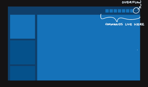
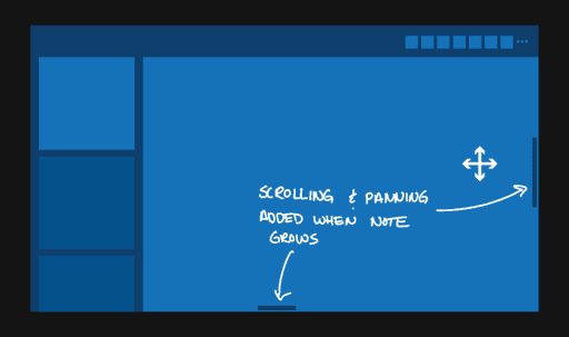
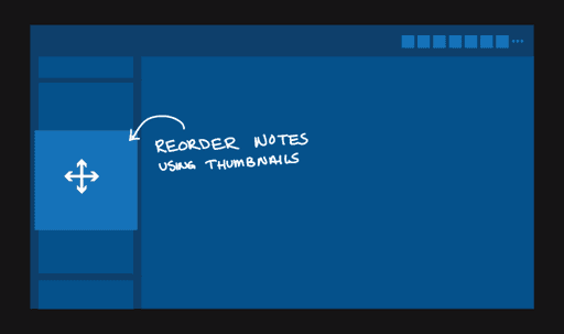
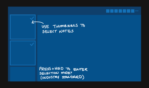
These early sketches were created to explore potential app model ideas.
Model showdown
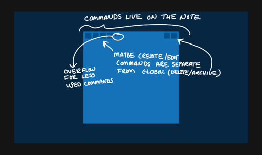
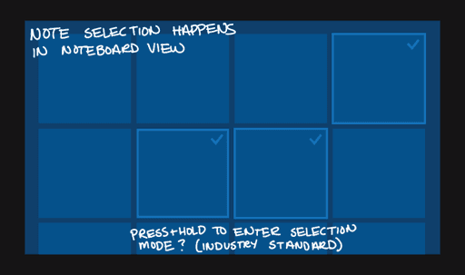
Working through the details, I narrowed down to a Lightbox app model. Partners were hesitant to switch away from the existing Master-Detail model of the current app. I delved into the micro-interaction details to explore how a Lightbox model would better solve our quick note goals.
Cross device refinement
As the details settled in place, I worked on translating the design to the gamut of Windows 10 devices, including mobile, tablet and desktop. We also broke down the work into a roadmap, planning a realistic timeline for each step of the process and working with a variety of dependencies across core-OneNote and Windows teams.
Key takeaways
Unfortunately, due to org structure changes, I was unable to follow through on this project to the end. The work eventually manifested as the Ink Workspace shipping for Windows 10, which is a great start on some of these goals. However, I believe more progress can be made on creating a reliable, quick capture experience, aware of it's physical and digital context, with intelligent retrieval. For example, to mimic how you might stick a Post-it note to the door to remind you to take something in the morning, a phone could smartly use the GPS sensor to know where to buzz a reminder. Or, carrying the same metaphor the the digital realm, imagine being able to 'stick' a note to a website in your browser, allowing you to remind you of something the next time you visit.
Today, my desk is still surrounded by Post-it notes. However, I do believe it is possible (though challenging) to create an experience compelling enough for people to make the switch.

