Two Worlds
Bridging the gap between the old and new Windows
OCT 2013 - FEB 2014
The challenge
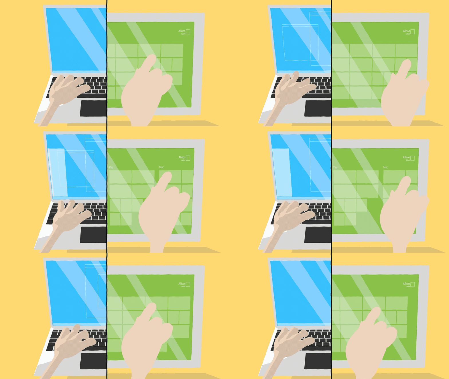
Towards the end of Windows 8.1, it was clear we needed to continue to improve the experience for desktop users. I had already worked on making Windows Store apps behave more like typical Windows apps (making sure they appear on the task bar, giving them a title bar, and ensuring you could always access the taskbar, etc.). However, the obvious elephant in the room was the Start experience.
Merging Starts
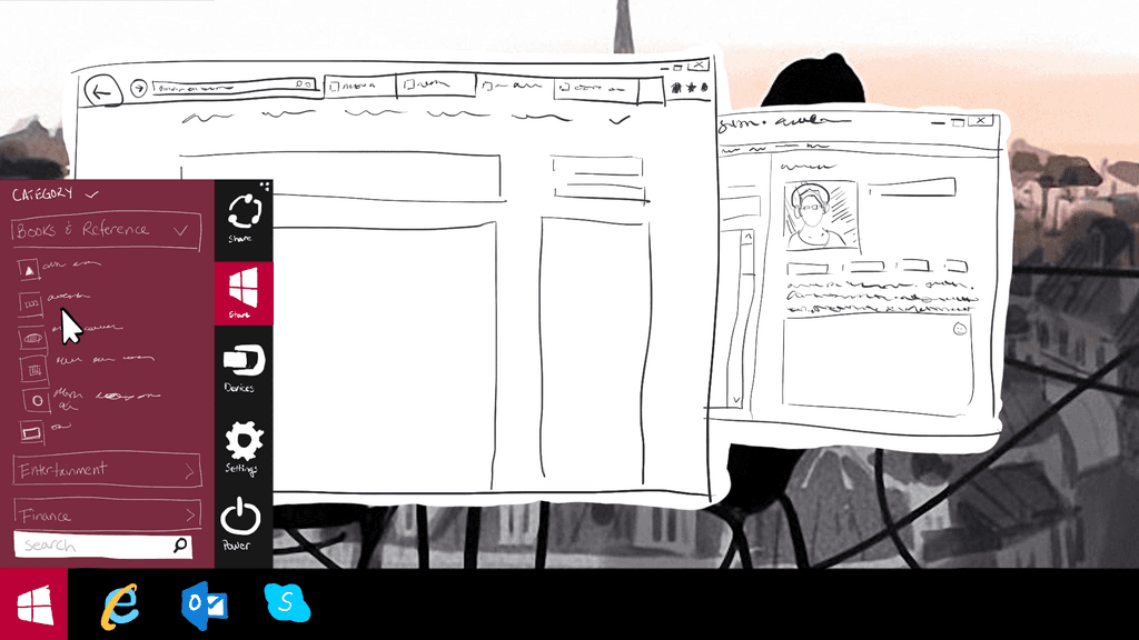
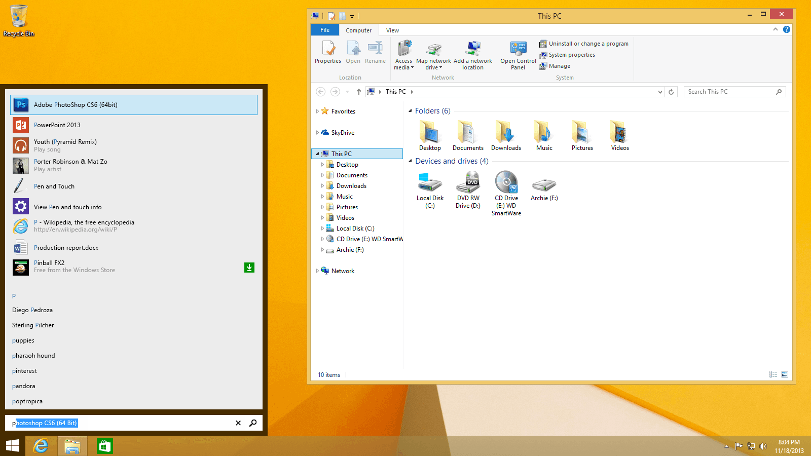
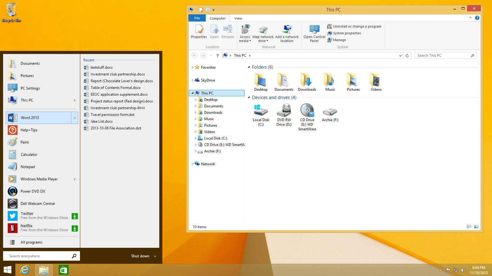
There was still desire to merge the two worlds, the old and new, the tiles and the Start menu. My first sketches were a quick simple exploration of this.
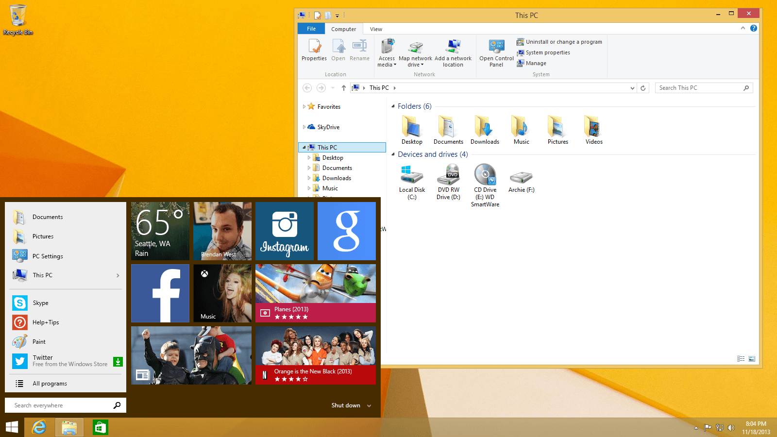
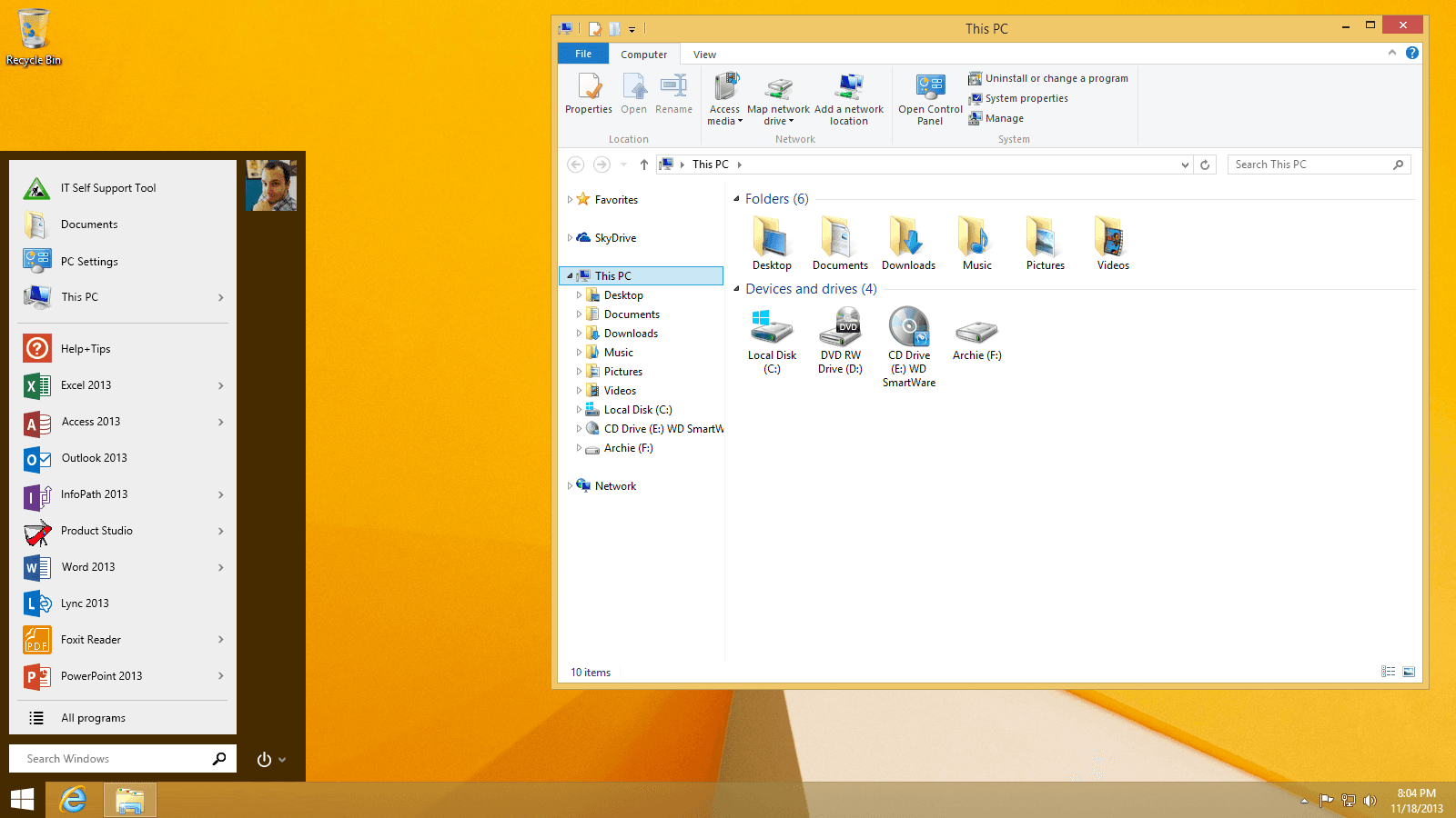
With many quick iterations and refinement, targeting a very quick turnaround, we landed on what would later become the Windows 10 Start menu.
There are many states and features encapsulated within the seemingly simple Start menu. We had to work through questions of various Search states, jump list, various OEM settings and starting states, screen sizes, internationalization across many languages, enterprises settings and restrictions, as well as many other concerns that came up as we worked.
Other Desktop-centric designs
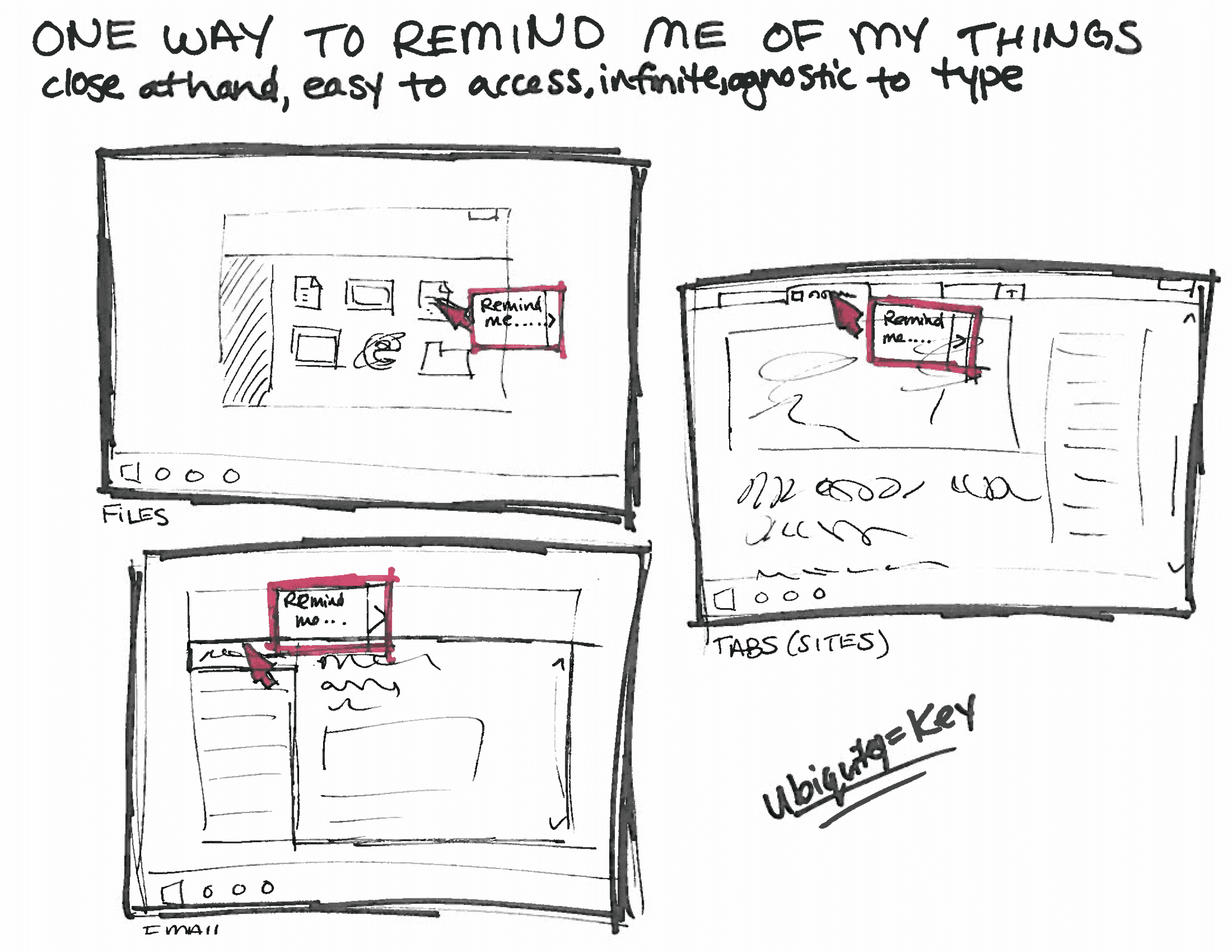
As early Windows 10 work began, I explored other possible features targeting power Desktop users. One exploration focused on how to maintain context and state across your digital and phyiscal world through omnipresent reminders.
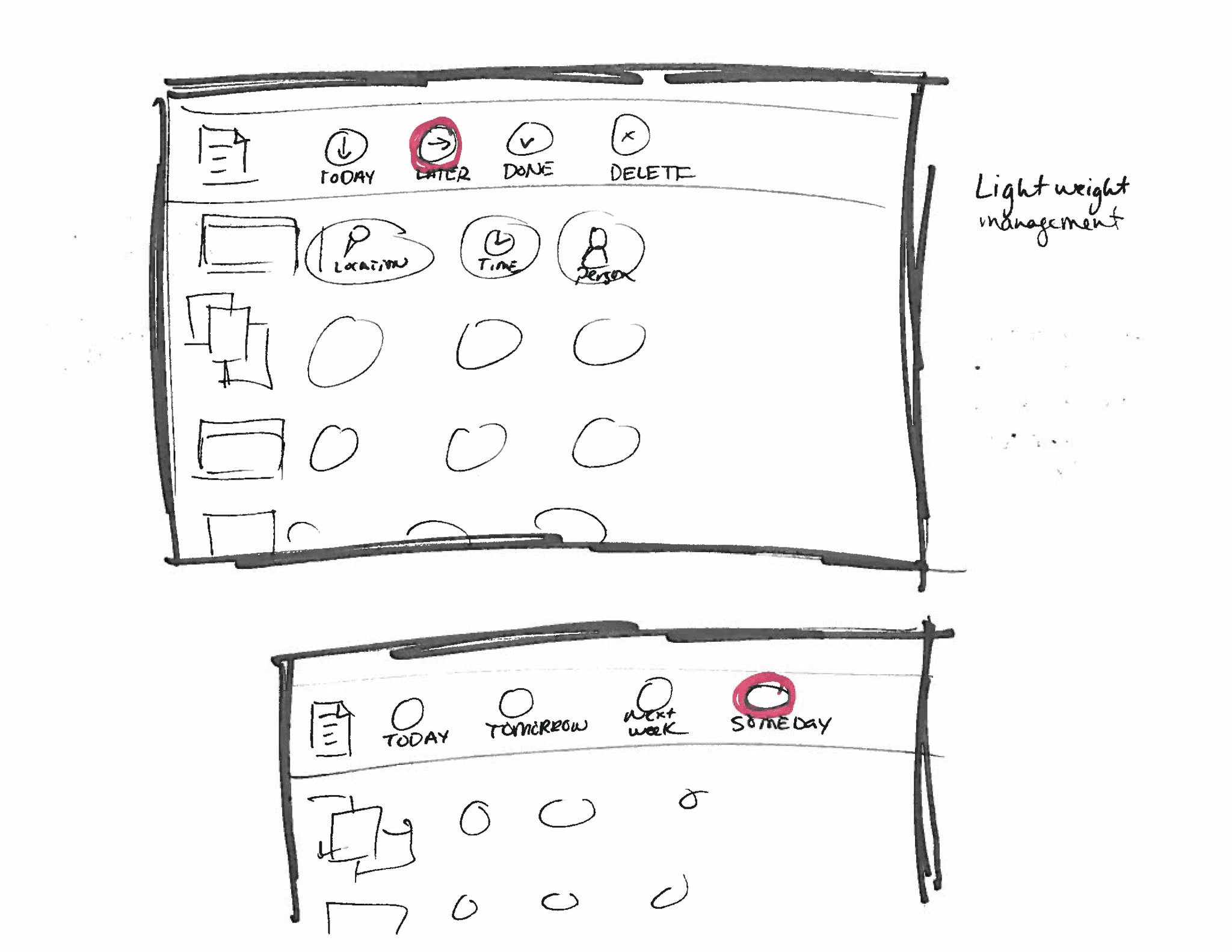
As an OS-level functionality, imagine if you could add reminders to all your digital assets, from files, browser tabs, and emails. These reminders can be triggered by both physical and digital context, and can also provide an overarching view of my projects and work.
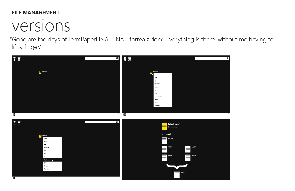
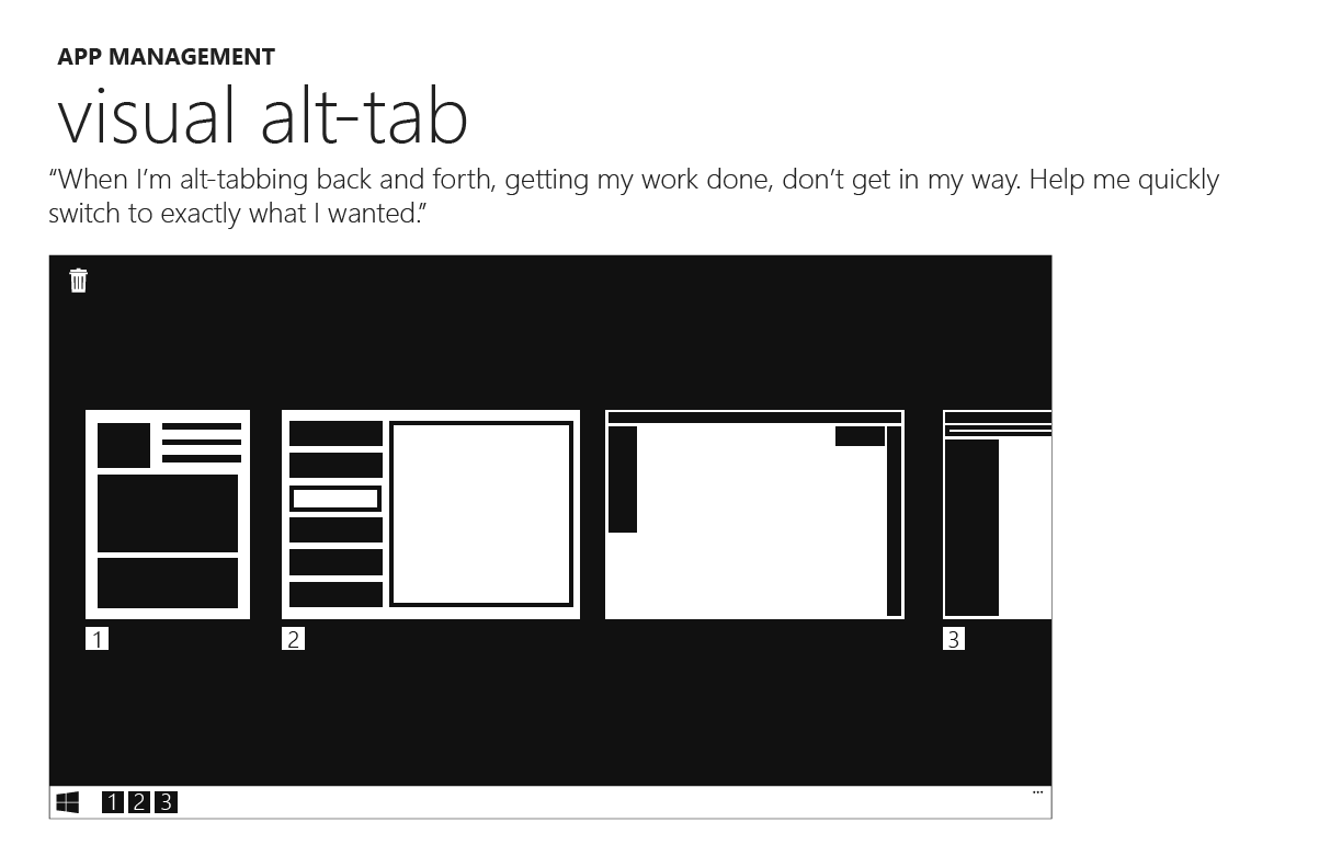
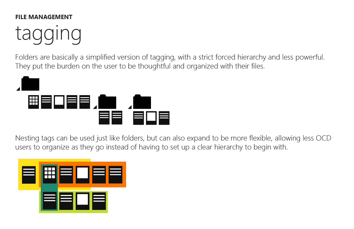
Another set of features focused on file management, and empowering the fascinating existing ways people use the Desktop today.
I also created prototypes playing with different task bar functionality. Below is a quick example exploring what a multi-level taskbar could empower.
A prototype I created to explore a hierarchical taskbar.
Key takeaways
All the work on this page represents efforts during the early part of the project, where you need to think big with just enough details to get others excited. To find new challenges for myself, I chose to leave the Windows team before I could be a part of bringing these concepts to reality. However, I do love the complexity of window and file management, creating systems that respect current habits, while supporting a wide variety of users who all think and work differently, creating something simple enough to pick up and use, but powerful enough to help our users feel awesome.
